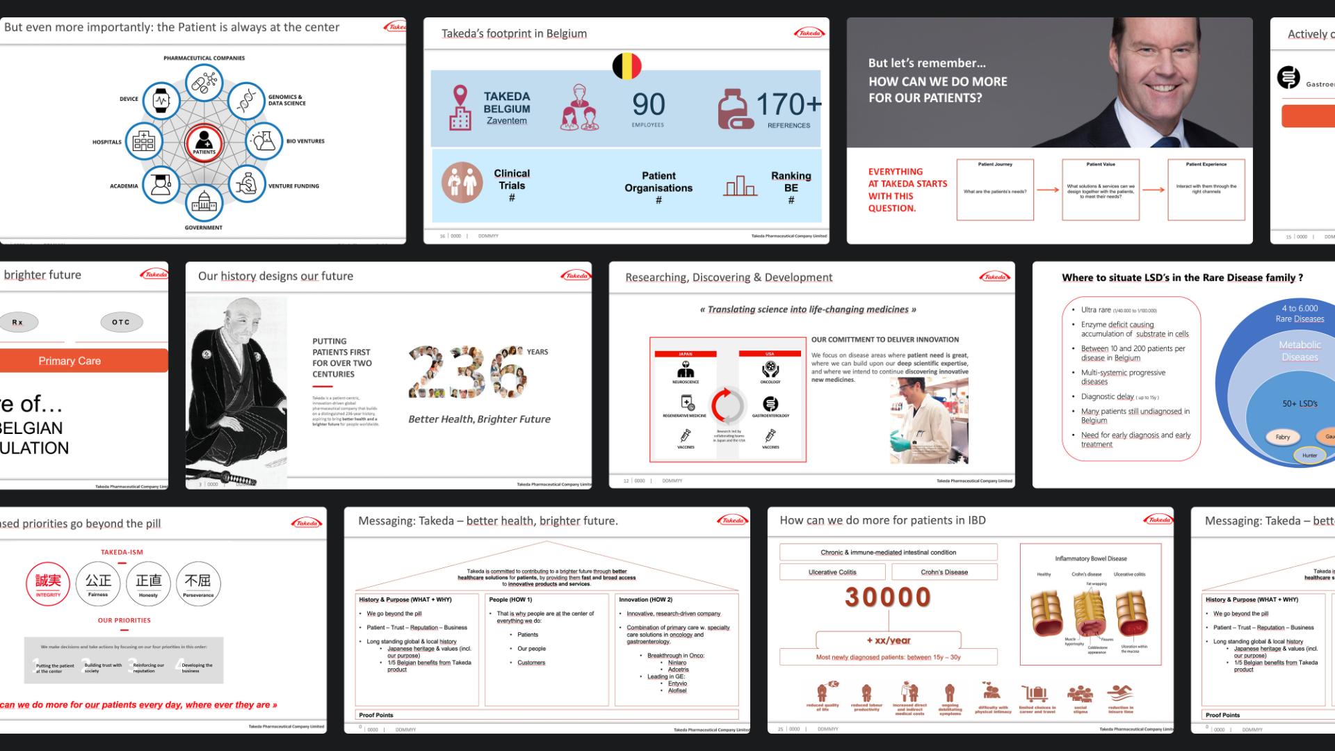
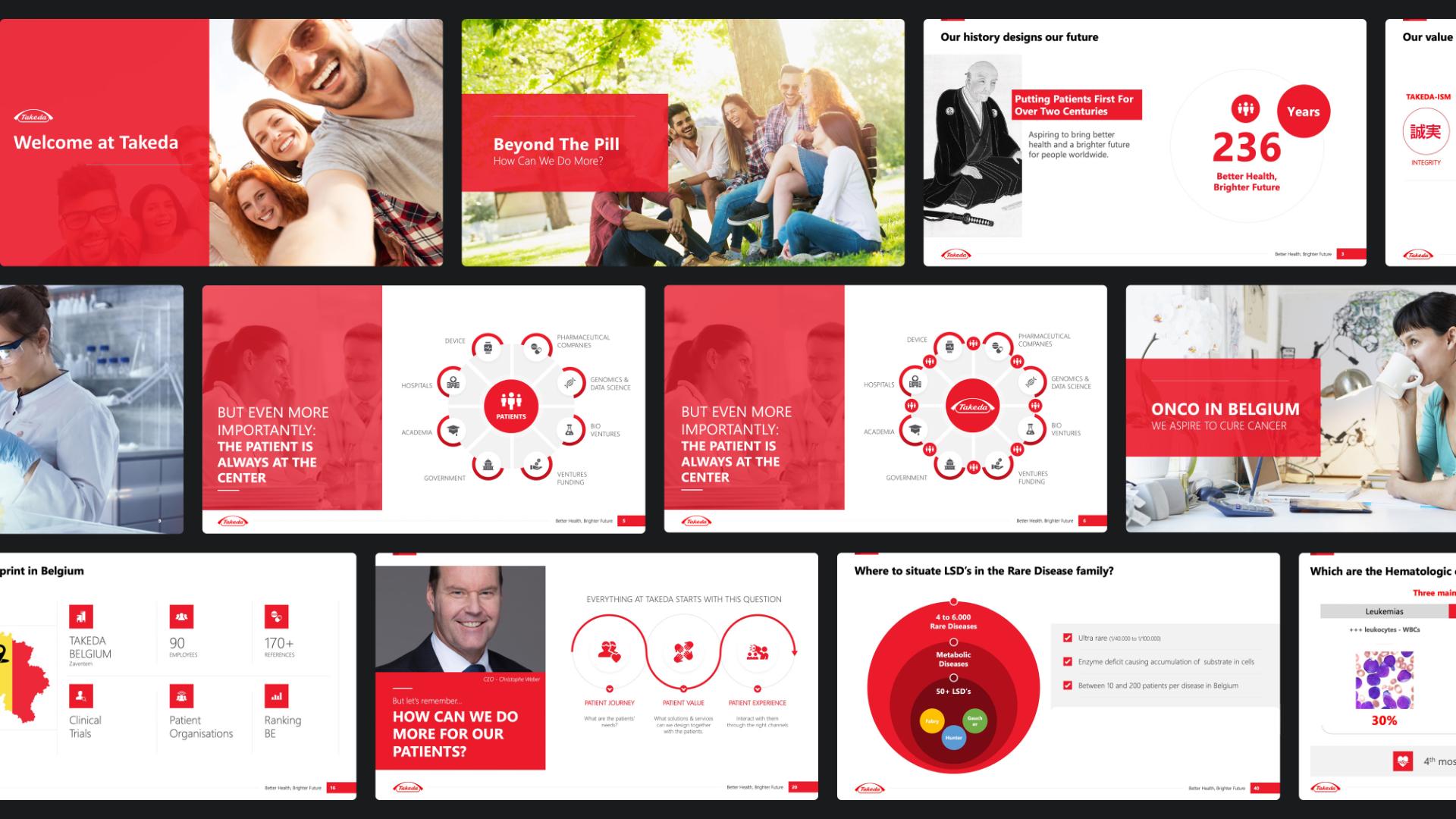
For Takeda, the content of the corporate presentation was already largely fixed. So our task was not to debate the content again, but to make sure it really worked on a slide. That’s often where it gets difficult. Especially when a presentation has to be delivered live and shared afterwards as a handout. Because what’s useful on paper is often too full on screen. That’s why we proposed two versions. And yes, sometimes that also meant deliberately splitting one busy slide over two or three slides. Because as soon as your audience starts reading, it stops listening. And then you lose your impact.
More breathing space is not a detail. It’s what makes a presentation digestible.
Want a presentation like this too?